Honorable Mention
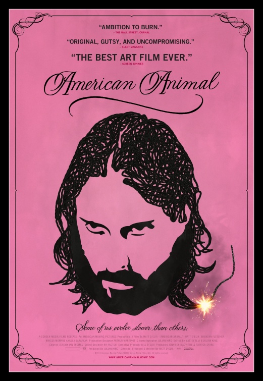
American Animal: It may be a stretch to dub American Animal “the best art film ever,” as Screen Junkies does in this poster’s hyperbolic pull quote, but that’s the only strike against an otherwise spot-on one-sheet, which nails this odd indie’s unlikely blend of grating quirk and classy undercurrent. As pink as the undies often worn by Matt D’Elia’s ailing antihero, the ad wreaths its wiry subject in handsome curlicues, and even throws in a lit fuse to hint at his volatility. The poster, like the film, finds common ground between the high- and lowbrow, the artful and the infantile. [Poster]
The Cabin in the Woods: The poster for The Cabin in the Woods is one of 2012’s few whose design instantly doubled as an unofficial logo, so much so that a later one-sheet needed only include the established graphic’s silhouette. The cabin-as-Rubik’s-Cube may seem obvious and simple, but it’s also perfect and universally legible, rightly promising a mad puzzle of a horror picture. The vintage model eventually produced by Mondo Gallery is notable for its M.C. Escher influences, but it misses the true triumph of this campaign: a deceptively indelible signature image, defined by twists and turns. [Poster] [Article]
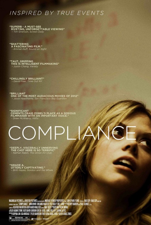
Compliance: No matter how you felt about Compliance, a divisive thriller more or less about the loss of dignity, the film’s poster easily trumped its in-text missteps, huddling poor Dreama Walker in a corner and surrounding her with meaningful details. Amid that fine stack of critical endorsements lies the film’s title, whose “C” perfectly encircles Walker’s eye, driving home the sick scrutiny her character endures. Best of all is that whiteboard’s message of customer-is-always-right encouragement, urging fast food employees to dutifully “smile!” The by-the-book irony expertly communicates the film’s themes, arguably even better than the film itself. [Poster] [Article]
The Best

10. Hello, I Must Be Going: Beautiful first for its fetching color scheme, which runs from magenta to teal as its city lights bleed effortlessly into pool water, the poster for underseen indie Hello, I Must Be Going has all the charm and allure long provided by star Melanie Lynskey, who managed a breakthrough with the film despite years in the business. The immediately expressed intimacy between Lynskey and co-star Christopher Abbott deserves kudos, but what seals the deal is that disarming asterisk, which, in addition to leading you to the movie’s tagline, serves as what may be cinema’s cutest hint of emotional baggage. [Poster]
9. Skyfall: Has there ever been a classier Bond poster than this one-sheet for Skyfall? A black-and-white beauty that handily puts Brad Pitt’s Chanel No. 5 ad to shame, this classic shot appears pulled from a fashion magazine, and yet has all the bravura one would expect from 007. No title necessary, folks: You know the number, and you know the hallmarks, from Big Ben to that gleaming Aston Martin. Toss in Daniel Craig in an expertly tailored suit, and 50 years of the world’s best spy leap out at you with panache. [Poster]
8. The Dark Knight Rises: The flagship poster for The Dark Knight Rises offers the year’s best use of negative space, letting the clouds above a crumbling Gotham form a familiar bit of iconography. Apart from simply looking flat-out fantastic, this ad—easily the best in an endless string of collages and character posters—makes an unforced suggestion of a city’s salvation, providing destruction-piercing light as gritty as the tone this trilogy’s always aimed for. [Poster] [Article]

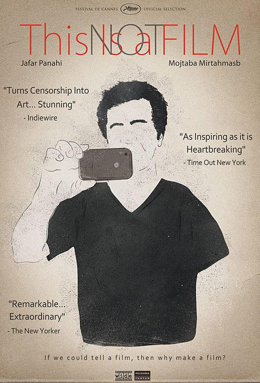
7. This Is Not a Film: Jafar Panahi’s This Is Not a Film continues to be the year’s greatest filmic surprise, its bounteous triumphs seeming to have sprung out of nowhere. The same goes for the movie’s main poster, which adds compelling flourishes to an intriguing sepia look. Of course, the illustration of Panahi, who’s seen grabbing bits of his life with an iPhone camera, shows a man who’s dissolving, itching to make art as he’s stripped of his privileges. Already missing are his eyes—the essential tools of the filmmaker. And yet, the illustrated man keeps recording, just as adamantly as that title keeps the word “Not” eclipsed, as this is, most assuredly, a film. [Poster]
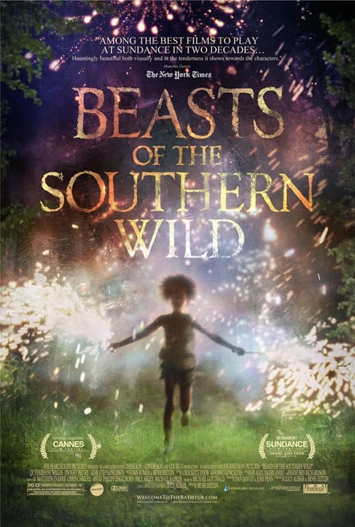
6. Beasts of the Southern Wild: No 2012 film poster made better use of a still than the memorable one-sheet for Beasts of the Southern Wild, appropriating an early shot of a sparkler-toting Hushpuppy (Quvenzhané Wallis) and winding up with a magical movie’s vibrant calling card. One of the greatest virtues of Beasts is the beauty it finds in the unkempt and the ramshackle, so it’s only appropriate that the image isn’t even in focus, and appears distressed despite a very clean design. It’s a fine representation of the movie’s knack for allowing brilliance to shine through tumult. [Poster]
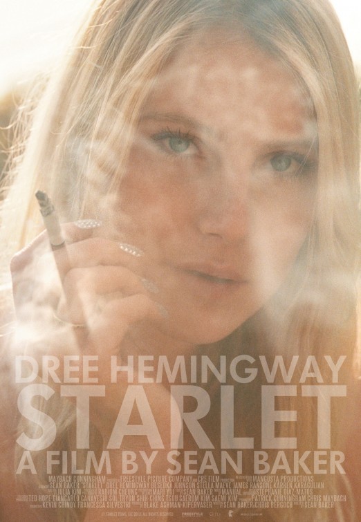
5. Starlet: Can a star be born on a poster alone? The one-sheet for Sean Baker’s Starlet would seem to suggest “yes,” as this single shot of leading lady Dree Hemingway, whose all-star ancestry is alluring enough, defies you to look away from it. It’s hard to remember the last time smoke looked so ethereal or intoxicating, tempting you to inch closer and see the blue of Hemingway’s eyes. The key detail? Those rhinestone-encrusted fingernails, which do all the talking about the comely character’s need for growth. [Poster] [Article]

4. Zero Dark Thirty: There’ll be those who’ll find pretense in the minimalism of Zero Dark Thirty’s best poster, but poster design doesn’t get much more audacious than this. One must have a great deal of confidence in his product to snuff out the name altogether, not to mention a great deal of foresight. The blacking out of the one-sheet’s words, which, of course, speaks to the offing of bin Laden and the classified nature of the story, immediately sparks interest from viewers, magnetically drawing them in and inciting desire to learn more. It’s the perfect poster for a political movie long shrouded in secrecy. [Poster] [Article]
3. The Paperboy: With so many terrible posters resorting to generic character collage, it’s terrific to see The Paperboy find a novel way to present its players, all the while establishing mood and personalities to boot. In the great image that peers through the car window, we see a troubled Zac Efron, a flirtatious Nicole Kidman, and a shady Matthew McConaughey, and just beneath is a fitting sliver of a clearly villainous John Cusack. The coral color scheme works overtime, keenly conveying the film’s period and ably reflecting Lee Daniels’s gay sensibilities. Sure, the film’s gonzo nature is nowhere to be found, but one can’t quite advertise a urine-cured jellyfish sting. [Poster] [Article]
2. Moonrise Kingdom: The moment it was released, the stunning poster for Moonrise Kingdom was a shoo-in as one of the year’s best, its design at once traditional, defiant, youthful, and adult. Packed with all the meticulous whimsy for which Wes Anderson’s known, the illustrated knockout dwarfs its young lovers in a fairy-tale forest, and, right down to their straight-on peering from within, invites you to get lost too. In Anderson’s usual yellow, the text elegantly adorns the rich background, creating a scrolly stack of names and uncommonly bumping crew listings to the top. Part Hansel and Gretel, part Viscontian decadence, it’s one for the wall. [Poster] [Article]

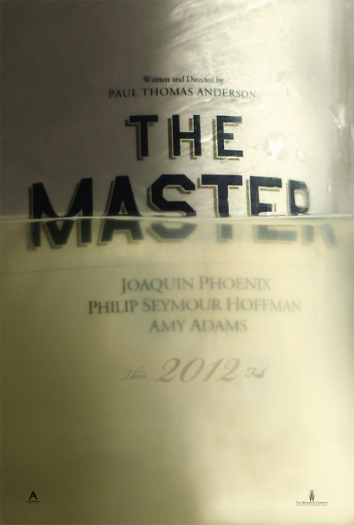
1. The Master: No other poster had more to express this year than The Master’s traffic-stopping lead ad, a bisected beaut that’s begging for analysis. Conceived as a shot of a liquor bottle floating in its own potent elixir, the image leads with the key element of Freddie Quell’s (Joaquin Phoenix) alcoholism, only to forge more paths in the process. With the text bobbing in liquid, one gets a sense of the early ocean setting, but more importantly, there’s the implication of Freddie’s personal quandaries, like whether joining Lancaster Dodd (Philip Seymour Hoffman) means sinking or swimming, or whether or not the world itself will finally swallow him up. Freddie’s unsure feet and cloudy outlook aren’t so great, but when it comes to the optimism surrounding this poster’s success, the glass is most definitely half full. [Poster] [Article]
To check out The Worst Movie Posters of 2012, click here.
This article was originally published on The House Next Door.
Since 2001, we've brought you uncompromising, candid takes on the world of film, music, television, video games, theater, and more. Independently owned and operated publications like Slant have been hit hard in recent years, but we’re committed to keeping our content free and accessible—meaning no paywalls or fees.
If you like what we do, please consider subscribing to our Patreon or making a donation.

