
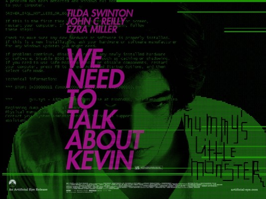
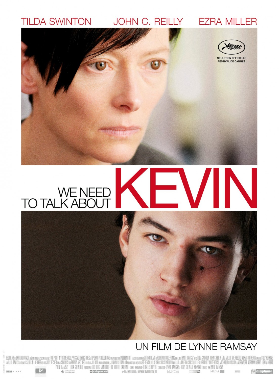
 The promotion of Lynne Ramsay’s We Need to Talk About Kevin has been all over the map, not just in the sense that at least four studios are handling portions of the film’s international release (Oscilloscope is distributing stateside), but also in terms of the wide, eclectic range of posters that’s trickled out over the last several months. An eccentric vision of a Columbine-esque story about a mother straining to understand her son before and after he massacres his high school peers, the movie isn’t the easiest to market, and the posters confirm as much, suggesting that a whole host of designers took cracks at conveying themes of intense angst and maternal turmoil. The variations have included a ghostly black and white expression of the mother as abandoned conscience, a sepia-toned image of mother and son when rebellion takes root, a garish green and purple quad that’s all hard-rock-blaring-in-the-bedroom rage, and a typical union of headshots and generic text.
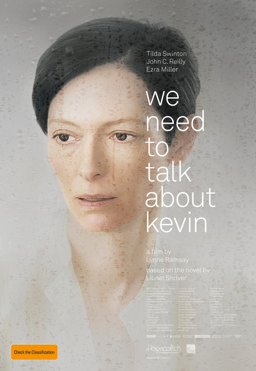
The most successful poster is one that communicates a kind of gorgeous misery, which, given Ramsay’s presumed approach, also makes it the most appropriate. Whereas the prior images opted for varying degrees of horror, this rain-pelted one sheet gently highlights humbling devastation, and rather than eclipsing the mother, vividly isolates her and ushers her to the forefront. A single, deeply impactful tear is the poster’s focal point, its long trail on Tilda Swinton’s cheek beautifully and subtly differentiating it from the surrounding raindrops. It’s a bit of private torment amid an unforgiving deluge, and that it’s such a quiet, near-anonymous gesture is a pity in itself. Seemingly simple, the whole water effect does wonders for the poster’s overall look. Aside from ably emphasizing gloom, the play on the droplets imprisons Swinton’s character in what must indeed feel like a haze of filtered reality, with the world seen through a foggy, speckled lens of unanswered questions. Most brilliantly, the drops create a certain cracked quality that elevates the design to the level of high, Renaissance-style art, as if Swinton were a long lost model for Vermeer.
For film buffs, one of the more gratifying aspects of this image is that Swinton is ever-increasingly entrusted with carrying a poster on her own, a duty that, in Hollywood, is only handed to a select few women. Her films certainly aren’t the sort that are drawing in mass audiences, but from Julia to I Am Love (which even sees her costars literally written off in her presence), Swinton has been positioned as an indisputable star, her viability no less showcase-worthy simply because she sticks to offbeat work. It’s plausible that this relatively new design is in part a response to the raves Swinton is receiving for her performance, for no matter how tempting it may be dial up the edginess of a ready-to-snap Ezra Miller, it’s more beneficial to advertise the prestigious, awards-friendly, recognizable headliner. Besides, if a film is fortunate enough to possess Swinton’s inimitable looks and talent, the wisest course of action is to let her lead the way. She puts a great face on a movie.
This article was originally published on The House Next Door.
Since 2001, we've brought you uncompromising, candid takes on the world of film, music, television, video games, theater, and more. Independently owned and operated publications like Slant have been hit hard in recent years, but we’re committed to keeping our content free and accessible—meaning no paywalls or fees.
If you like what we do, please consider subscribing to our Patreon or making a donation.


